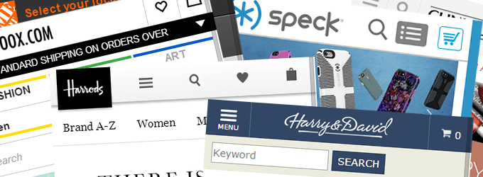
I am (finally) working on a mobile design for the main ecommerce website I run. As I started thinking about the layout of the site and of the home page, I wanted to see what approaches leading online retailers were taking for their mobile designs, and what ideas and best practices I could apply.
The sort of questions I was looking for feedback on were wide ranging, including:
- Would a short or a long home page be more effective for my customers?
- What balance should there be between providing category navigation on the home page and on presenting featured offers and products?
- Should the search box be open or closed by default?
- How many links should go in the footer?
So, I pulled together a showcase of over 100 mobile ecommerce home page designs, mainly taken from the larger online stores, as a source of inspiration.
I won’t claim that every one of these examples represents mobile home page design best practice, but they all caught my eye for one reason or another, and collectively, provide an insight into the current trends in ecommerce design for mobile devices.
To capture the screenshots, I used Chrome’s mobile emulation mode set to iPhone 6 to get a wider page width. This worked fine for the most part, except that I couldn’t hide the scroll bar on the right side of the page.
I’d love to know a better way to capture these types of screenshots, ideally on an iPhone 6 sized screen. These alternatives for capturing mobile website screenshots might be worth checking out too:
