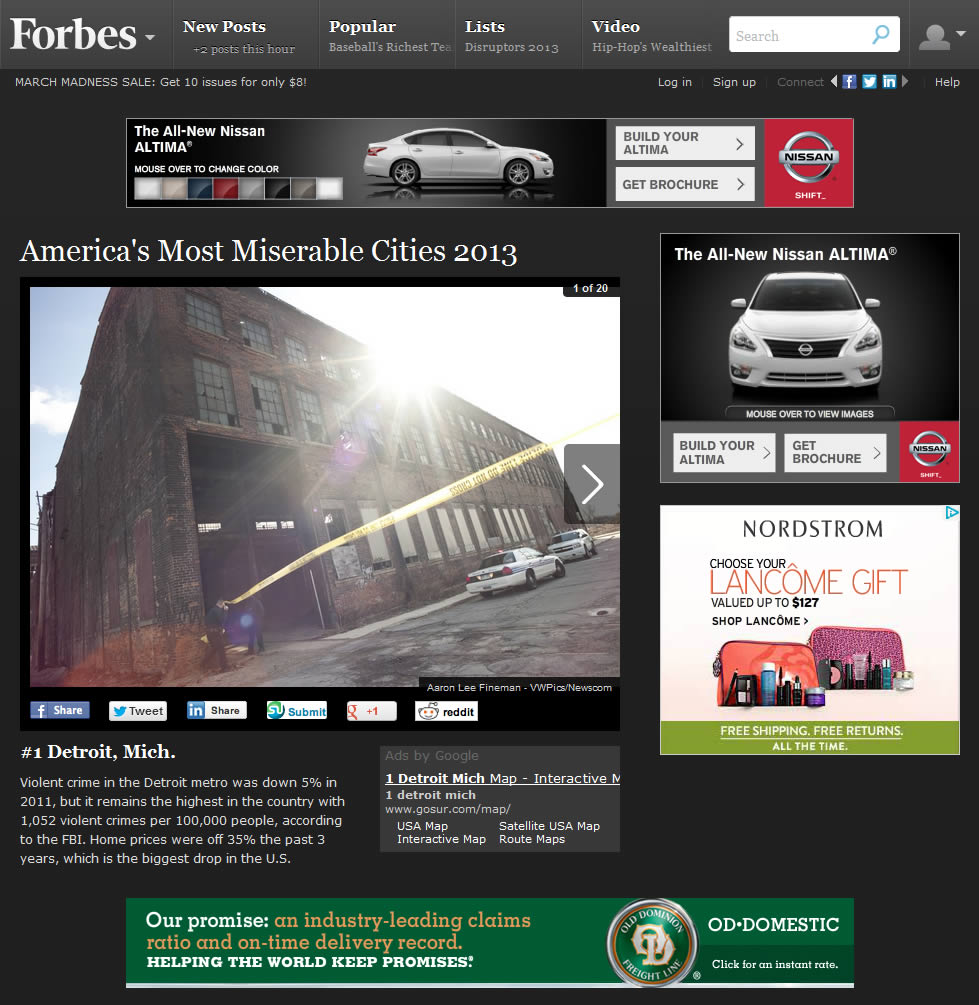
Check out this slideshow from Forbes about America’s Most Miserable Cities. Other than the paper-thin amount of reporting going on, the main thing that strikes me is the amount of advertising on each page.

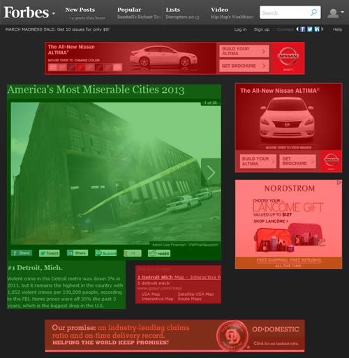
The content is completely crowded out by the ads, making it an unpleasant experience to read. In fact, ads covered approximately 318,000 px of the page whereas the content represented about 340,000 px (generously including the social sharing buttons under the slideshow image).
This means that is only about 6% more content than ads. It’s easier to see the split if both the content and ads are highlighted:

According to Google’s own guidance on what constitutes a low-quality page:
Does this article have an excessive amount of ads that distract from or interfere with the main content?
If this slideshow is not an example of low-quality content according to Google’s definition, I don’t know what is. Please, Forbes, I understand you generate your revenue through advertising but don’t forget about the user completely.