I’m a huge Netflix fan. I love their site and have spent many hours rating and finding movies and fiddling with my queue.
Given that fact, I thought it might be fun to write a post about 10 things that Netflix could do better on their site. Unfortunately, my list quickly degenerated into nit-picking, so I gave up.
However, there is one area I think is open to improvement, and that is the primary navigation.
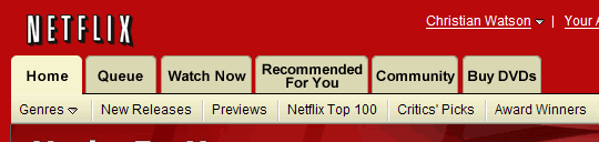
Here’s the current navbar:

A number of issues stand out:
1. Why are three of the tabs large and three small? Obviously, Netflix is trying to assign importance based on the size of the tab, but based on whose criteria?
I doubt whether many people use the “Watch Instantly” tab more than “Movies You’ll Love” (which takes you to your recommendations page).
Netflix is trying to push their online movie service by positioning it prominently in the navigation.
However, navigation shouldn’t be used as a marketing tool and I’m not aware that this size differential follows any known web convention.
2. There are two home buttons — “Browse DVDs” and “Home” beneath it. There’s simply no need to have both; one of them should go.
3. Navigation labels are not consistent. For example, you can “Browse DVDs” but the recommendations tab only mentions “Movies You’ll Love.”
However, when I click on this tab I’m recommended movies, documentaries and TV episodes. This label is clearly inaccurate.
In addition it’s a little misleading to call this tab “Movies You’ll Love.” I don’t have to love every movie or show that is recommended to me to want to watch them, so there’s no need to sell it as if I will.
4. Navigation labels are overly wordy. Take “DVD Sale $5.99,” for example.
The word “sale” implies a price drop from the regular price. Therefore, you can’t have a permanent sale as all you have is permanently low prices.
So, you can’t really use this word in global (i.e. permanent) navigation.
5. There’s no reason for the navigation labels to be presented as graphics. Given the breadth of Netflix’s audience, it would be better to use actual text so that it can be resized.
Based on these points, here’s my stab at a revised navigation:
Although you can’t tell from the graphic, the labels and the tabs would now be resizable. In addition the tabs are as wide as they need to be for the labels on them.
I’d move “Queue” to be next to “Home” as I imagine it is the second most used tab.
The labels are also shorter and more to the point:
- Browse DVDs” becomes “Home” because that’s what this page is.
- Your Queue” becomes “Queue” — obviously, it’s your queue.
- Watch Instantly” becomes “Watch Now” because it’s simpler.
- Movies You’ll Love” becomes “Recommended For You.” I would prefer to use “Recommendations” as this most clearly describes what is behind this tab. However, that word is a little too long. I’m also tempted to just use “Recommended” but am not entirely sure if this is clear enough.
- DVD Sale $5.99″ becomes “Buy DVDs” because that’s what you can do on this page and it’s not a sale.
- The “Home” link in the sub-navigation goes away as it is no longer needed.
I realize that it’s pretty arrogant to redesign any part of a site — let alone the navigation — when you don’t know any of the issues behind the decisions that were made.
However, I think it’s interesting to try, even if it’s based on the opinion of one user.
Update: there’s an interesting discussion about the validity of my redesign over at Hacking Netflix.
I have to disagree with you on almost all your points.
1. “navigation shouldn’t be used as a marketing tool”…What? The entire reason for creating a website in the first place is as a marketing tool. The navigation is made to direct you to where you want to go and 98% of their business is not web developers and usability experts. They are normal everyday people who want to rent DVD’s.
When someone new to the site says, “I want to rent a DVD” do you think they’re more likely to click “Home” or “Browse DVDs”?
2. Three tabs large and three small. This is an amazing use of navigation. They are telling their users which buttons are the most useful. In a glance I know I can Browse DVD’s, Watch Instantly, and view my Queue. The other buttons I rarely use. It’s rare that I go to Netflix not knowing what I’m looking for and usually if I don’t know what I want it’s because I’m going to see what I have coming next. I also use the Watch Instantly button all the time because it shows you movies that are in your Queue that you can now watch online. It’s a great features.
Your navigation is way too plain. I looses the spark that Netflix already has, and most of your information seems to be based off personal understandings and beliefs rather than actual data to back your claims.
For example you changed “DVD Sale $5.99” to “Buy DVDs”. I think you have caused more confusion and would ultimately realize a reduced click rate because it is far less descriptive.
I think that redesigning something out of a need for function is great, redesigning something for something to blog about is pointless. The changes and additions are not providing benefit to the user. They are making the navigation less descriptive and harder to guess where you’ll end up.
Navigation is just that. A tool to help your users navigate through your information to ultimately have them make a purchase. Netflix, in my opinion, does a lot right and most of it you threw away because it didn’t follow any web conventions you’ve seen. That sounds like, “No one else is doing it so it can’t be right!”
I don’t agree with all the changes, but I think redesigns that are never used are far from pointless. I’d enjoy seeing more of these, Christian.
Meh. I think many sites (including Netflix) could slightly improve their navigation. But, your changes, while valid, make it slightly less inviting and engaging.
*Seth* — great feedback, thanks.
1. Yes, web sites are often marketing tools; however, *navigation is not*. It’s simply a way to get people quickly to where they want to go. Therefore it should be as clear and simple as possible.
I understand the issue with the “Home†tab and I’d agree that neither the current solution nor mine is perfect.
The ideal solution might actually be to create a new “Browse DVDs†tab which gives you a better starting point for browsing movies from different eras, genres, etc.
2. You may rarely use the “Recommendations†tab, but it’s one of the first that I go to. However, I rarely use the “Watch Instantly†tab, so that’s wasted space for me.
Of course, we’re arguing based on audiences of one so either of us could be correct from a larger audience standpoint.
However, I would expect that many more people are looking at their recommendations than watching movies online and so that tab should be given more prominence.
3. My navigation example is just a quick mockup — I should have mentioned that. That’s why it looks plain. It’s not supposed to be a fully realized comp. I still think my point is valid about using regular text for the labels though.
4. All of my recommendations are based on my personal understandings and my experience of using the site. I don’t have any data to base these off. That’s why it’s so interesting to get your completely opposing opinions (which I very much appreciate) and why you should never design for yourself.
5. Re. *navigation being just a tool*, I believe that by making the changes I’ve suggested the navigation will be a better tool. You disagree — fair enough. Obviously, and changes would have to be tested to know for sure.
6. Regarding *web conventions*, yes, if no one else is doing it then chances are what you are doing is wrong.
Remember that people spend more time on other sites than your own and so they expect your site to function like other sites. If it does not, they get confused and have a harder time using your site.
I have to agree completely with SETH. Christian you just have way to much time on your hands if you are spending your time re creating a simpler version of what the netflix engineers have come up with. Keep in mind they have several hundred different versions of the website out there in known test groups. They have all the data to back up what works and what doesn’t. Click through rates within the test group give them far more accurate details than what your using…anyway why dont you fix Blockbusters site next. I need a good laugh.