Movie review aggregator website Metacritic underwent a complete redesign last week, much to the dismay of its regular users.
Although the new site sports a more modern design (though it is arguable how attractive it is), the feedback overwhelmingly reports that the site is now harder to use.
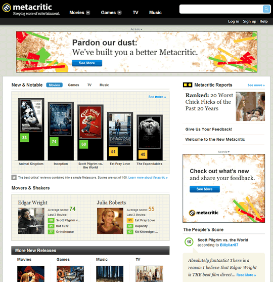
Here’s how the new site looks:
Compared with the old site:

As a regular user of the site, I too find the new version less usable.
Although this may be partly due to my unfamiliarity with the new design, it does take more clicks for me to get to the content I’m looking for (the list of movie/game reviews) and I find the new presentation less scannable.
I’m sure the design team must have been pretty surprised by the outpouring of negative feedback, because when they posted a preview of the new site the feedback was overwhelmingly positive.
Of course, they only provided snippets of what the new site would contain, which presented out of context don’t look like bad ideas at all. Some full page screenshots would have been more effective in soliciting useful feedback, however.
This week the design team have responded to the feedback with an update on the redesign, but the fixes they’ve implemented based on the feedback seem pretty minor.
I understand that the redesign was driven by a need to replace the technology platform on which the site was based.
However, an evolutionary approach to adding the new features to the site would have avoided upsetting so many loyal users.
Another approach that might have been more successful would have been to introduce the new site as a ‘beta’ or preview version alongside the old one.
Here’s another take on the redesign.