Carousels are a popular way to showcase a variety of ‘featured’ content on a web site’s home page. By cycling through the different features they enable a large amount of content to be presented within a set physical space on the page.
Read MoreTime for a New Adventure
It’s been very quiet on the Smiley Cat blog so far in 2015. The reason? I have been looking for a new job, which has occupied most of my free time in-front of the computer. The good news is that I have accepted a position based in Bangkok, Thailand. How about that for a change of scene from Austin, Texas? Read More
My Top Web Apps and Software of 2014
Two years ago I posted about my best apps and software of 2012, and so I thought I would revisit my list to see what has changed in 2014.
Read More
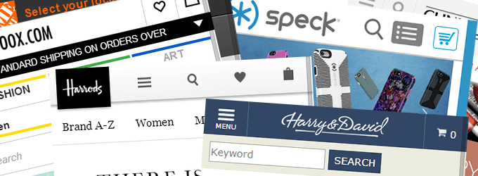
Ecommerce Mobile Home Page Design Gallery
I am (finally) working on a mobile design for the main ecommerce website I run. As I started thinking about the layout of the site and of the home page, I wanted to see what approaches leading online retailers were taking for their mobile designs, and what ideas and best practices I could apply. Read More

18 Fantastic Free Fonts to Make Your Web Designs Stand Out [Infographic]
Whether you’re looking to make your designs techier or more classy, this collection of free web fonts by Plato Web Design has something for every occasion, along with tips on how best to use them.
Read MoreLooking to Hire a Search Engine Marketing (SEM) Strategist
We have an open position for an experienced search engine marketing strategist to lead organic and paid search for our portfolio of web properties.
The role is about 75% organic search and 25% paid search and is primarily focused on our two online stores, Supercircuits.com and SecurityCamerasDirect.com.
How to Use Your Existing Organic Search Traffic to Create Better Content
Inbound marketing through the creation of relevant, useful content is quickly becoming the primary SEO tool to drive more organic search traffic to your site.
However, developing content that will rank and drive traffic can be a hit-or-miss affair. There is no guarantee that a piece of content you write will rank highly enough to make the effort worthwhile.
The good news is that people are already asking questions on search engines and coming to your site for answers. Rather than start from scratch, why not make sure your content meets the needs of this existing traffic?
Read More

Exploring Navigation Conventions Across Federal Reserve Bank Websites
The United States Federal Reserve banking system is broken up into 12 districts or regions, each of which is overseen by a regional bank. Don’t ask me how but I was recently looking at the websites for these banks.
As I did so, I started thinking about navigation design. I am always interested in the similarities and differences in the way that different people organize information that covers the same subject matter.
Whether it is the grouping of information on a home page or the ordering of links in a main navigation bar, it is fascinating to see what conventions are followed and (for better or worse) where these trends are ignored.
Read More
Thoughts On Writing Better Ecommerce Product Content
A recent article by the Nielsen Norman Group – 3 Tips for Better Product Descriptions on Websites – got me thinking about product content. In particular, I want to talk about the first tip the author provides – ‘answer questions.’
Read More
