As I was compiling my Elements of Design banner ad design showcase I was struck by the range of wording used as calls-to-action (CTA) on the different ads. Thankfully, the traditional, generic “Learn More” was virtually nowhere to be seen.
Based on these and other CTA best practices (see this button design showcase for more examples), here is a collection of call-to-action examples that you can use to improve conversion rates on banners, emails, landing pages, and buttons just about anywhere.
Of course, there are multiple variants for each of these examples, and you can experiment with capitalization, punctuation (such as exclamation points), and icons to signify additional urgency.
Create Account
- Create a free account
- Get a free account
- Join today
- Sign up for free / Sign up: It’s free
- Sign up today
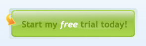
Free Trial / Demo
- Free 30-day trial
- Try it free / Try it for free
- Try it now
- Try the free demo
- See it in action
- Start your free trial today
Get the Report
- Download free report
- Download now
- Read the white paper
- Get it now
- Get the facts
- View free report
Get More Info
- Click here for more information
- Contact us now
- Discover the benefits
- Explore the benefits
- Explore now
Start Shopping & Saving
- Begin shopping now
- Save now
- View deals
- I want that
Just Start Already!
- Get started
- Go now
- Start now
- Take a look
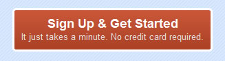
If you have room, it can also be a good idea to include a secondary message below the main call-to-action to reinforce your message. Secondary messages that emphasize risk reduction or ease of use can be very effective.
For example:
Sign Up Today!
No credit card required.
Here are some examples from landing pages to show how these calls-to-action look when applied to a button: