
Mobile product detail pages (PDP) follow a largely standard design. Given the small area of screen real estate available and the commonality of the content to be conveyed it is not surprising that PDP designs have become quite similar.
In this post I’ll examine which retailers are trying new ideas for displaying content and offering unexpected functionality on the PDP. Here are 14 examples to explore.
Looking for more examples? Read part 2 of this post.
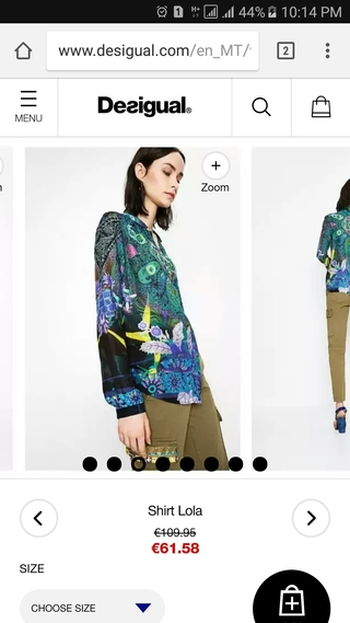
Image Filmstrip
Product images are the most important part of a mobile PDP. Given the small visible area, retailers should enable their customers to see as much of the product as possible. Desigual’s approach to this is to display product images in a filmstrip rather than the typical single hero image approach.
Showing a portion of the next product image not only provides some more visual interest to the page but also plays on the curiosity of the shopper, encouraging them to swipe to see the next photo. This is more effective than simply providing pips to show that more product images are available.
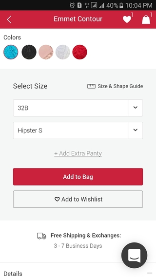
Add Extra Item
Subscription underwear retailer, AdoreMe, has a useful feature for women who are ordering a bra and panty set.A link on the product detail page lets the customer easily order an extra pair of panties to go with the set. This is convenient for the shopper and an effective way of upselling for the retailer.
A link on the product detail page lets the customer easily order an extra pair of panties to go with the set. This is convenient for the shopper and an effective way of upselling for the retailer.
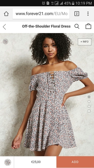
Swipe Up/Down to View Images
Forgoing the traditional right-to-left horizontal swipe to view more product images, Forever21 requires you to swipe up and down to view the image gallery.
In addition, the retailer has gone all-in to focus solely on product images as there is no other content on the page. To view any product information you need to tap the small “INFO” box.
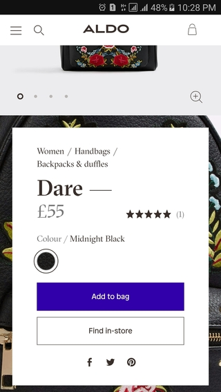
Fixed Page Background
Online shoes retailer Aldo uses a fixed background image to embellish the product page. The background image is a close up of the main product image, which reinforces the design aesthetic of the product.
Although it is a unique approach, I found that when scrolling, the fixed background image competed with the summary content on the PDP, making it feel a little harder to read.
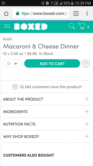
Show Item Popularity
In addition to providing the standard add-to-wishlist button, Boxed displays how many other customers have already added this product to their wishlists.
This provides a strong social proof message about the popularity of the product, so that the customer can feel confident making a purchase decision.
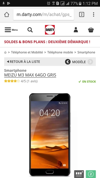
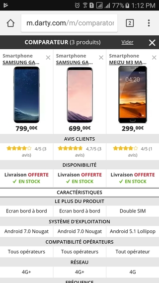
Product Comparison
Product comparison functionality is common on desktop but less so on mobile. Darty bucks that trend by providing users with the ability to compare up to three products on their mobile PDP, which is useful for certain product categories such as smartphones.
Tap on the black tab at the bottom of the screen to add a product to the comparison tool:
Then tap on the numbered green tab to view the compare products page:
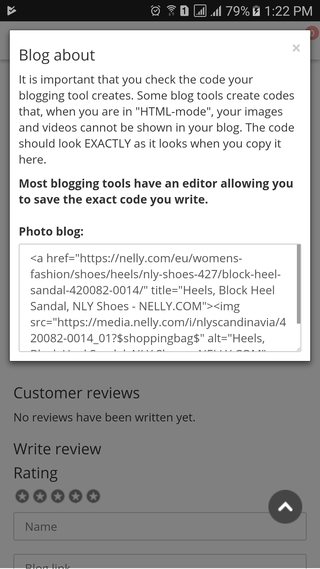
Blog this Product
Almost all mobile ecommerce retailers offer social sharing options on the PDP. However, Nelly also offers the option to embed product information in a blog post. Tap on the pen icon to blog about a product:
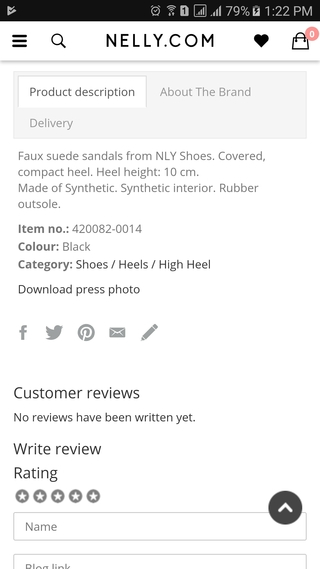
This opens a modal window from where the necessary HTML can be copied in order to add the product image and key info to a blog post:
Product Summary
Most mobile product pages prioritize the product image by placing it at the top of the page. Bonobos takes a different approach by leading with a pithy product summary at the very top.
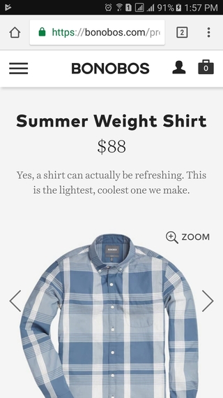
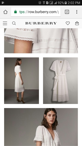
Image Grid
Burberry gets the maximum mileage out of their product images by repeating them further down the PDP in an interesting layout.
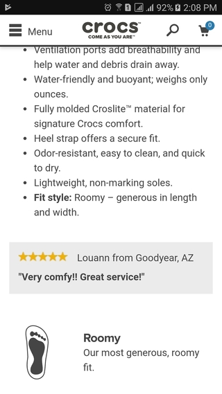
Highlighted Customer Review
Crocs doesn’t wait for the user to actively seek out customer reviews. Instead, they bring customer feedback up into the product content by inserting a featured customer review within the product description.
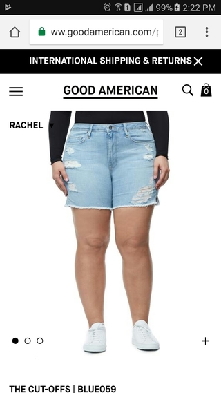
Choose Model to View Clothes On
Most clothing models don’t look like everyday people. To counter this, Good American offers the ability to choose which size model on which to view product images.
So, if you’re a size 14, for example, you don’t have to imagine how the item might look on you while viewing it on a size 0 model. This is a great example of the Good American brand living up to its promise of offering clothing in inclusive sizing.
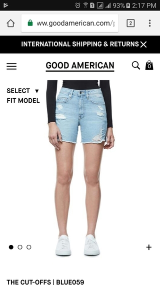
Tap on the “SELECT FIT MODEL” button to display options for viewing the clothes on different size models:
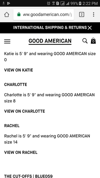
In the example below, I chose to view product images with the size 14 model wearing the clothes.
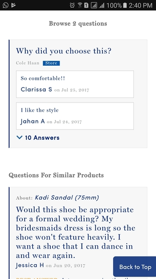
Why Did You Choose This?
Providing customer Q&A is a useful addition to product reviews so that customers can get answers to specific questions. However, it can be challenging to establish a base sampling of Q&As so that customers will feel that if they ask a question it will be answered.
Cole Haan addresses this issue by asking a simple question to everyone who bought the item: “why did you choose this product?” This is a creative way to add user content to the Q&A section.
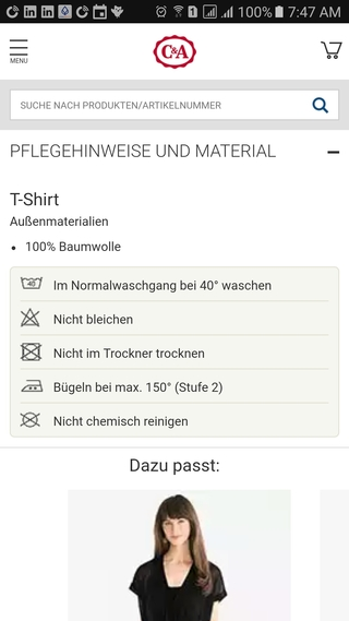
Detailed Product Care Information
Although not unique, the next feature is still relatively uncommon among apparel retailers. C&A provides detailed product care information on their PDP so you know exactly how to look after your purchase.
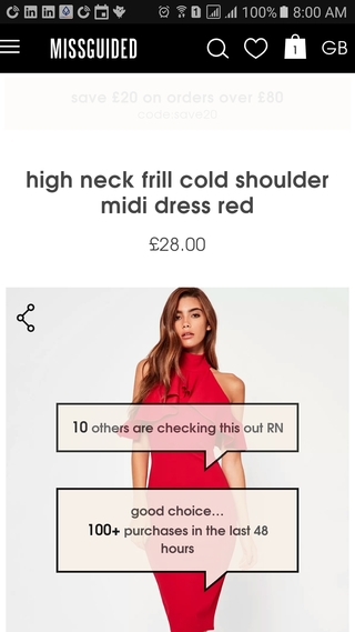
Real-time Social Proof
Compared to in-store shopping, mobile shopping is a relatively solitary activity. Missguided tries to counter this by displaying real-time social-proof messages over the product image showing how many other people are also viewing the product and how many have purchased it recently.
This helps to add urgency — if other people who are viewing the item purchase it perhaps it will go out-of-stock; and also confidence that the item is a good purchase as many other customers have also bought it.
For even more examples of mobile PDP design, read part 2 of this post.