I recently wrote a post highlighting novel and innovative approaches online retailers were taking to product detail page design. Well, I had quite a few more examples to share, so I thought I would include them in a separate post. So, here are several more ways that some ecommerce retailers are rethinking PDP design.
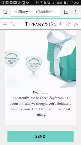
Drop a Hint
Tiffany is a popular retailer for purchasing (expensive) gifts. Given the high price of the merchandise, you really don’t want your significant other to make a mistake and buy something you didn’t want.
So, to avoid this, on the product page they conveniently offer the ability to send a ‘hint’ email about an item you like.
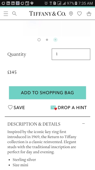
Tap on the “DROP A HINT” button to open a short form. Enter yours and the recipient’s information to personalize a short message and hit SEND. Very nicely done!
Share on Pinterest
Most mobile product detail pages offer social media sharing options. west elm has clearly identified the value of Pinterest as a social media channel, which is why it has chosen to display the Pinterest “Pin It” button over the main product image.
This makes it as easy as possible for visitors to pin product images to their Pinterest boards.
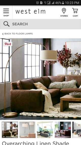
Image Thumbnails
Product images are the most important element of the product detail page. With limited screen real estate available on mobile devices and easily distracted users, it’s important to display as much of the product as possible.
This is why some retailers, such as RedBubble, display image thumbnails of alternate product views rather than the traditional “pips” for indicating more images are available.
Even though the user has not chosen to view any additional images, they can still see other views of the product in the thumbnails and get a better overall understanding of the item.
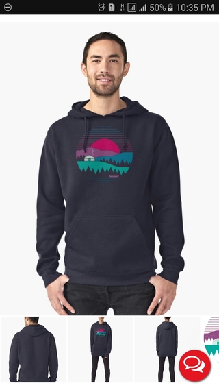
Image thumbnails also encourage users to view more images of the product by surfacing potentially interesting product shots.
If the retailer uses pips to indicate more images are available, the user has no idea if the additional images are worth swiping through and will be less likely to do so.
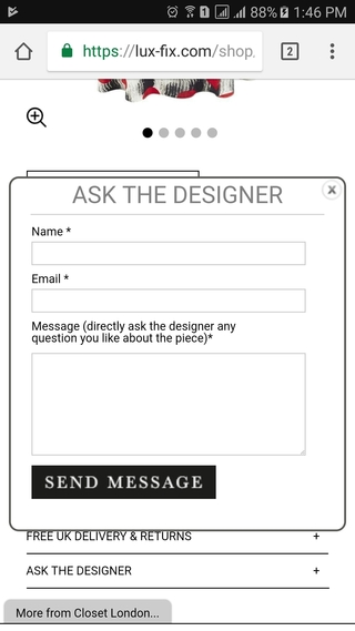
Ask the Designer
Product Q&A can be highly useful for removing customer concerns and other barriers to purchasing. Lux Fix has an unusual take on product Q&A where you can ask a question to the designer of the product rather than other customers.
Tap on the “ASK THE DESIGNER” option on the PDP to display a modal form where you can write a question to send. This is also a nice way to establish a more human connection between the customer and the creator of the product.
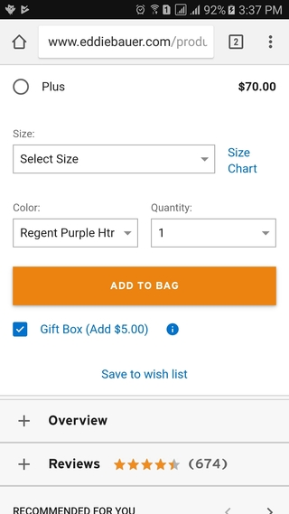
Gift Option
Gifting options are often kept hidden until checkout. This is fine for Amazon, but for some retailers customers may not know that gift options are even available. That’s why Eddie Bauer offers a gift box option right on the PDP.
Displaying gifting availability upfront like this could encourage site visitors to use the retailer to send gifts who might otherwise not have considered doing so.
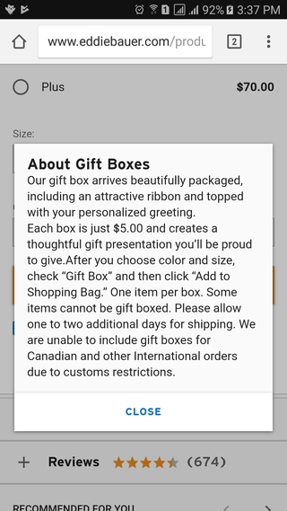
Eddie Bauer also provides well-written information about how the gift box option works, although the presentation of the content could be made more readable.
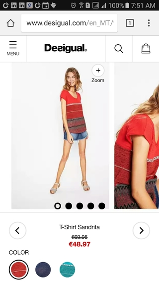
View Previous/Next Item
One challenge of mobile web design compared to desktop is that users cannot easily open pages in new tabs. On ecommerce sites, this leads to users “pogo sticking” between the catalog page and the PDP as they browse different products looking for the right item.
Desigual attempts to counter this by providing the ability to browse to other items from the PDP without going back to the catalog page. Tap on the left or right arrow to view the previous or next product in the catalog.
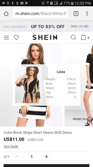
View Model Size Information
Determining whether a product will fit is one of the hardest aspects of buying clothing online. Just because it looks great on the model doesn’t mean it will do so on you.
SheIn tries to address this issue by making the model size information readily available on the PDP. Tap on the “Model Size” link to view a modal screen with all the pertinent details.
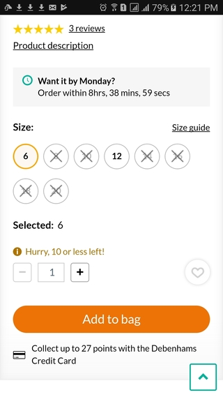
Only a Few Left!
“Fear of missing out” (aka FOMO) can turn website browsers into buyers. Debenhams creates this sense of urgency for low inventory products by highlighting sizes with only limited quantities left available.
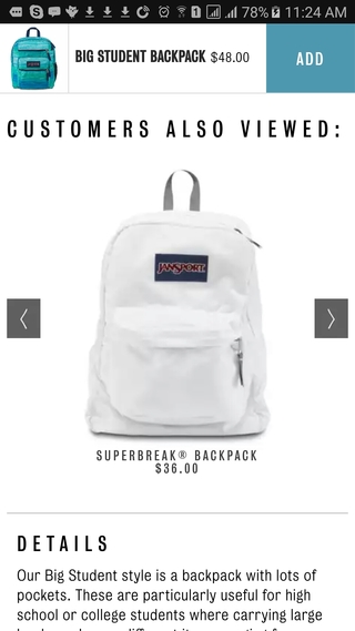
Sticky Add-to-Cart Button
I’m not sure if research has shown whether sticky add-to-cart buttons out-perform buttons embedded in the page. In any case, Jansport has taken the sticky button approach one step further by displaying it at the top when you scroll down the page.
I’m not sure how effective this is as my own instinct is to look further down the page for the add-to-cart button, so this approach could cause the button to be hard to see for new users who are unfamiliar with the Jansport site.
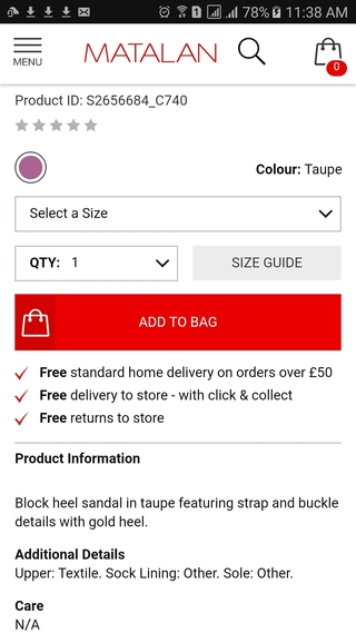
Prominent Delivery Information
Questions and concerns about the cost of delivery and returns are major impediments to online shopping. That’s why it’s important to make this information available to shoppers when they are making their purchasing decision.
In order to ensure that customers don’t miss this important information, Matalan displays their free delivery and returns information directly under Add-to-Bag button so that it’s impossible to miss.
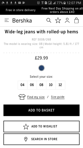
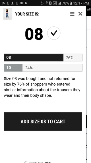
Find My Size
In a modern approach to the traditional size guide, Berksha offers a sizing widget which uses technology to suggest what size apparel shoppers should choose.
Tap on the “Find my size” link to get started.
A modal screen displays, into which you to enter your body information and provide size information from other stores that you shop at.
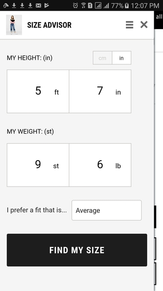
Based on this information, the tool recommends a size for you.
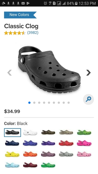
Color Option Thumbnails
Lastly, Crocs show color options in the form of image thumbnails rather than the usual color swatches. This makes it easier for customers get an idea of what a product will look like in a certain color without needing to select it.
This could lead to customers choosing colors that they would not otherwise, because they can see that the item looks good in that color.
For more innovative mobile PDP design examples, read part 1 of this post.