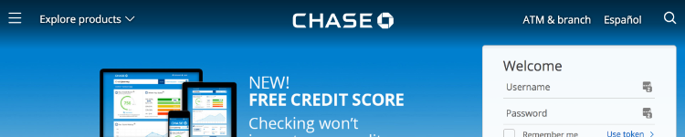
I really like the way that the Chase bank website logo animates as you scroll down the page. It just goes to show that even stuffy, corporate websites like banks don’t have to be “boring.”

Similarly, when you mouse over the “Explore products” menu, the options in the mega menu do not just display statically when the menu loads but animate into view instead.
It would have been easy to display the menu items fixed in place, so this extra level of polish really shows the degree of thought that has gone into the design.
Why go to these extra lengths? As I have mentioned before, these micro-interactions serve to improve user experience by imperceptibly making the experience of using the website more enjoyable.
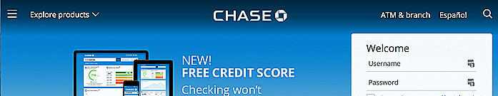
Sidenote: the Chase bank site is also an excellent example of thoughtful responsive design. Take a look at how the elements in the header are removed as you resize the browser.