Despite it being something like 20 months until the 2008 US presidential election, the campaign trail is already hotting up.
Given the amount of attention being placed upon how the presidential candidates are stacking up against each other, I thought it would be interesting to see how their web sites compared from a design standpoint.
Overall, I am largely commenting on the aesthetics of each site. However, I did have a few particular areas of interest that informed my opinions:
- Does the site provide a way for the candidate to differentiate themselves? Or do they all look the same?
- Has the web been utilized as the ‘great leveler’ between the rich and ‘poor’ candidates? I.e., does the site look professionally designed?
- Am I going to overdose on red, white and blue color schemes, US flags, stars and stripes backgrounds, etc?
- Does the site provide a clear and engaging call-to-action?
Other than putting current front-runners at the top and exploratory committee sites last, the list is in no particular order.
Barack Obama

There’s lots to like about this site, from the elegant, understated design to the action-oriented navigation. It’s also the only site with a clearly identifiable logo.
I like the bold “Donate” button — a clear call to action. However, the home page is a little light on content and could do with a search function.
John McCain

My first reaction was “what is up with all the black and grey?” I’m not sure what the designers were going for, but to me it just looks dreary.
Yes, the traditional red, white and blue is getting a little clichéd; however, I’m pretty sure that this isn’t the answer. To my mind, the lack of color makes McCain seem even older than he is (B&W = a time long ago).
On the other hand, my wife finds it ‘interesting’, so what do I know?
Hillary Clinton
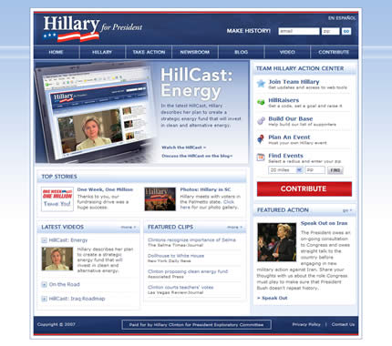
Although I criticized the use of icons on this site, overall this site is very pleasing to the eye. Although the traditional color scheme is being used, it has a contemporary feel.
Side note: If you’re going to display En Español so prominently, you should probably do more than provide a single page of Spanish content.
Bill Richardson

Pretty standard fare here. Not sure why the masthead and navbar is so separate from the rest of the site; I find it detracts from the overall cohesion of the site.
The color scheme is traditional to the point of being dated.
Chris Dodd

Nothing jumps out about this site. Plenty of content, which is good. Not sure why the gimmicky ‘Dodd Pod’ is given such prominence — why should I care what’s on his iPod playlist?
Dennis Kucinich

Oh dear. Was this site really designed for the 2008 election or was the design simply borrowed from somewhere back in the 1990s?
This is a shame because there’s clearly a lot of good content here; more than most of the other candidate sites.
Quick test: find the contribute/donate button. Took a few moments, no? Why is there a bunch of unnecessary links in the main navigation and no ‘donate’ button?
This site definitely does not ‘level the playing field’.
Joe Biden

Nothing wrong with this design, although it does make Biden look like a cable news presenter — what teeth!
I wonder how many clicks the graphics on the right get, given that they look a little too much like advertisements?
John Edwards

Edwards’ site has daringly (but, you might argue, not wisely) eschewed the traditional color scheme, opting for more earthy tones instead.
Maybe it looks more environmental. That being said, it’s still a well designed site.
I like the 3-step ‘how you can take action’ section. Makes it very clear and easy to get involved.
Mitt Romney

An elegant, clean design with good balance between the different sections. One of the better examples.
Sam Brownback

A mediocre design at best. The lengthy letter is misplaced on the home page and the scrolling news section makes the site look dated.
This is the least action-oriented of the candidate sites.
Duncan Hunter

Nothing wrong here and it’s nice to see a few other colors than the standard red, white and blue.
Jim Gilmore

The only site to use a serif font. Readability issues aside, does this make it appear a little less action-oriented than the other sites that use a ‘bold’ sans-serif font?
Overall, it’s a pretty workmanlike design; a little heavy on the gray perhaps. Oh, and the ‘take action’ icons are terrible.
John Cox

A close contender for the worse site design. From the video that plays automatically when you load the site, to the cheesy navbar mouse overs to the buttons that move when you mouse over them, this is pretty poor overall.
Mike Gravel

Not much to get excited about design-wise. At least the color scheme is non-standard, although it could do with a little more color in the body of the page to liven it up.
I do like the fact that Gravel’s issues are presented front-and-center on the home page, although I feel that the quotation from Thomas Jefferson wastes space. How about a quote from Mike Gravel instead?
Exploratory Committee Websites
The last three sites are for candidates who have not officially announced their candidacy and therefore do not have official ‘2008 presidency’ web sites.
Rudy Giuliani

Great slogan. And if things don’t work out he can always go into e-commerce.
Mike Huckabee
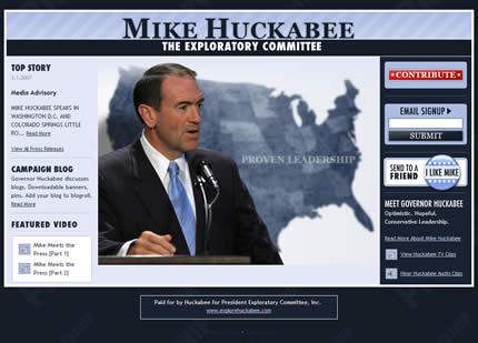
Pretty good overall design.
Tom Tancredo

Lacks the polish of the other two exploratory web sites. Functional at best.
Good Comments! Really impressive review.
I want to comment from SEO stand point. Most of the sites are Terrible from SEO stand point. Here are common mistakes
i) Most of them have a splash page where they ask their supporters to Sign up. This creates a barrier between SE Crawlers and the site content. Most of these splash pages are not properly linked to the inner pages, hence giving no room for SE Crawlers to crawl the inner pages. Most of SE crawlers are going to find these sites through direct links to the inner pages.
ii) Some site, (Hillary site for example) uses text embedded in images. This is again BAD from SEO point of view as Search Engines CANT read text embedded in side the images or flash.
No matter how important these candidates may be, they are equal to Search Engines like normal people. And there is plenty of time before 2008 to get a good page ranking and good Search Engine hits. I hope these candidates will focus on their sites from SEO point of view to win the contest on Search Engines War 🙂
I don’t think SEO is as applicable to these sites as you argue. Pagerank is always going to be the driving force of the ranking here, though I do agree with you that separating content from the spiders is a mistake.
I’ve always wondered why don’t smaller candidates try to rank for single issues, like “pro choice” or “border fence” — the obvious answer is time. But it’s still an interesting thought..
Great post! The reviews on these sites are very informative. It also shows that the degree of preparation these candidates have for the 2008 presidential race. I expect things heat up more as we come closer to November 2008.
Another great article with the theme that you did for tourism. I actually just posted the Australian political parties websites annalist today (day after you). They lack a lot compared to the websites you wrote about though.
Of the websites that are listed I like Barack Obama’s the best, it has a nice web 2.0 look with a nice feel and does not over use the American flag/ colours like his competitors. BUT does that make him less patriotic??? 😆
I also do not mind the black/ dark style of John McCain, it is different but still effective.
Thanks for the read..
I’m really torn by the John McCain website. On one hand, I really like the chances they’ve taken with the colour scheme by not falling into the standard red, white and blue, but on the other hand, it looks like he’s trying to sell me a Chrysler.
Barack’s site is the best of the bunch, but the typography used on his name at the top is too weak. I really like the treatment used for John Edwards. Bold, but not unfriendly.
It’s interesting how some certain design elements reoccur between these sites. Like the white frame with a dropshadow on to the gradient mainbackground… I didn’t realize that it was that popular.. 🙂
And also, almost all of the websites are made for 1024px screens, which is odd when your target is the entire population…
Great article anyway!
As far as SEO is concerned, what interested me in particular is that some of the candidates don’t own their own domain names. For example, http://www.billrichardson.com is owned by a cyber-squatter.
I can’t believe that Richardson’s team wouldn’t have tried to get this domain back or purchase it. Can you imagine what it would be worth if he became president?!
I noticed a “web 2.0 design theme”:http://www.webdesignfromscratch.com/web-2.0-design-style-guide.cfm on several of the sites, with the treatment of the navbar typically being the most obvious element.
An interesting takeaway from the John McCain site is whether it is better to create a design that will likely generate a strong positive/negative reaction from a visitor or whether it is better to create a more ‘neutral’ design that will appeal to a wider audience?